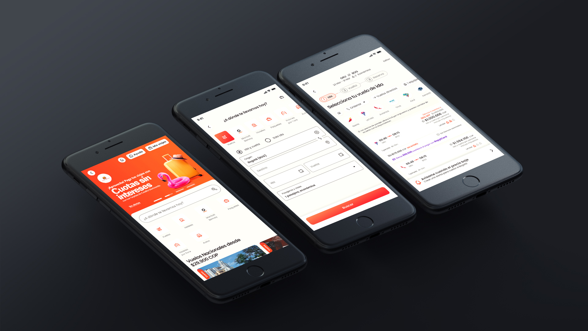
Rappi Travel Flights
APP | Web responsive (B2C)
Product Designer Lead, UXR, UX,
UI Designer and Facilitator
I led the design as an individual contributor, aligning design goals with product goals. I managed the full end-to-end design process—from research and co-creation with stakeholders to UI design, prototyping, usability testing, developer handoff, visual QA, and monitoring results.
Context
Rappi Travel is a B2C online travel agency available in seven Latin American countries.
Its mobile and desktop web app provides a simple, intuitive, and visually appealing experience, offering products such as flights, hotels, hourly hotels, car rentals, packages, buses, and tours/activities.
Flights represent Rappi Travel’s main product (67.1%)
Mobile is the main device (90%)
Most flight searches come from Colombia (59%).
Goal
Design goal:
Simplify and offer a high-quality experience to sell flights
Product goal:
• Decrease time on searching the flight's results section
• Increase conversion of flight sales
Method | Discovery
Following the Double Diamond method, we initiated the investigation phase by employing various research techniques to understand user needs and pain points.
• Problem inventories
• Competitive analysis
• Benchmarks
• Interview with stakeholders and users
• User Story Mapping to understand Jobs to Be Done
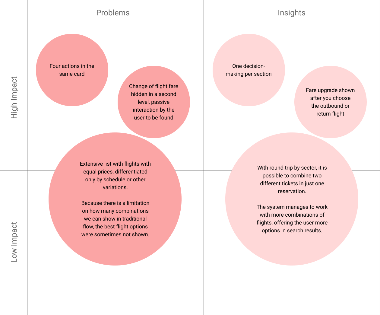
Problems | Insights
• Compiled problems and potential solutions
• Organized key insights in a prioritization matrix
• Prioritized solutions with the Product Head based on business impact
Solution
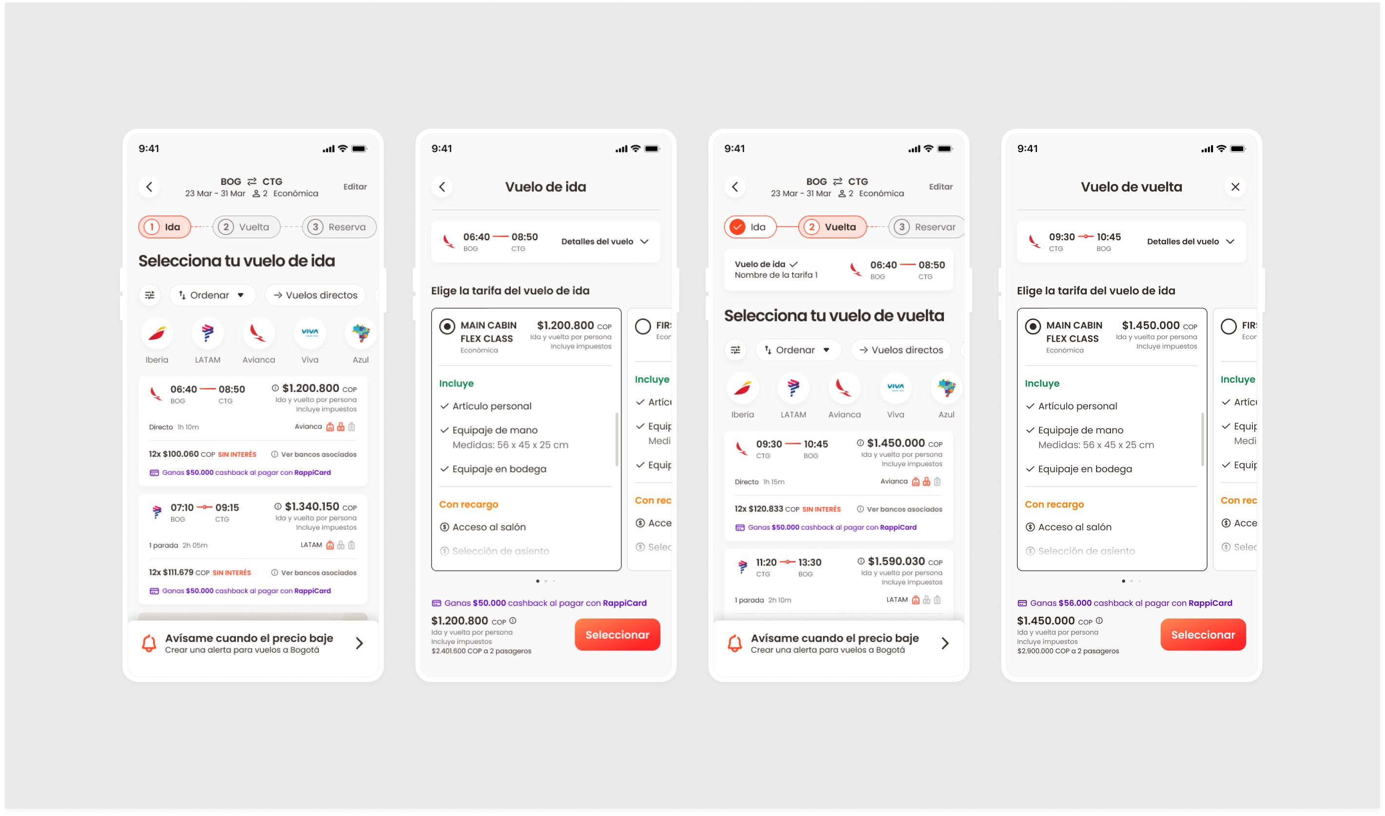
We redesigned the flight booking flow in sections.
Co-creation
• Used co-creation in Design Review meetings with stakeholders
• Presented design versions and gathered diverse opinions
• Collected quick feedback and aligned the team
• Explored alternative problem-solving approaches
• Fostered collaboration and shared ownership
• Worked toward delivering a complete product
UI Design
High fidelity screens
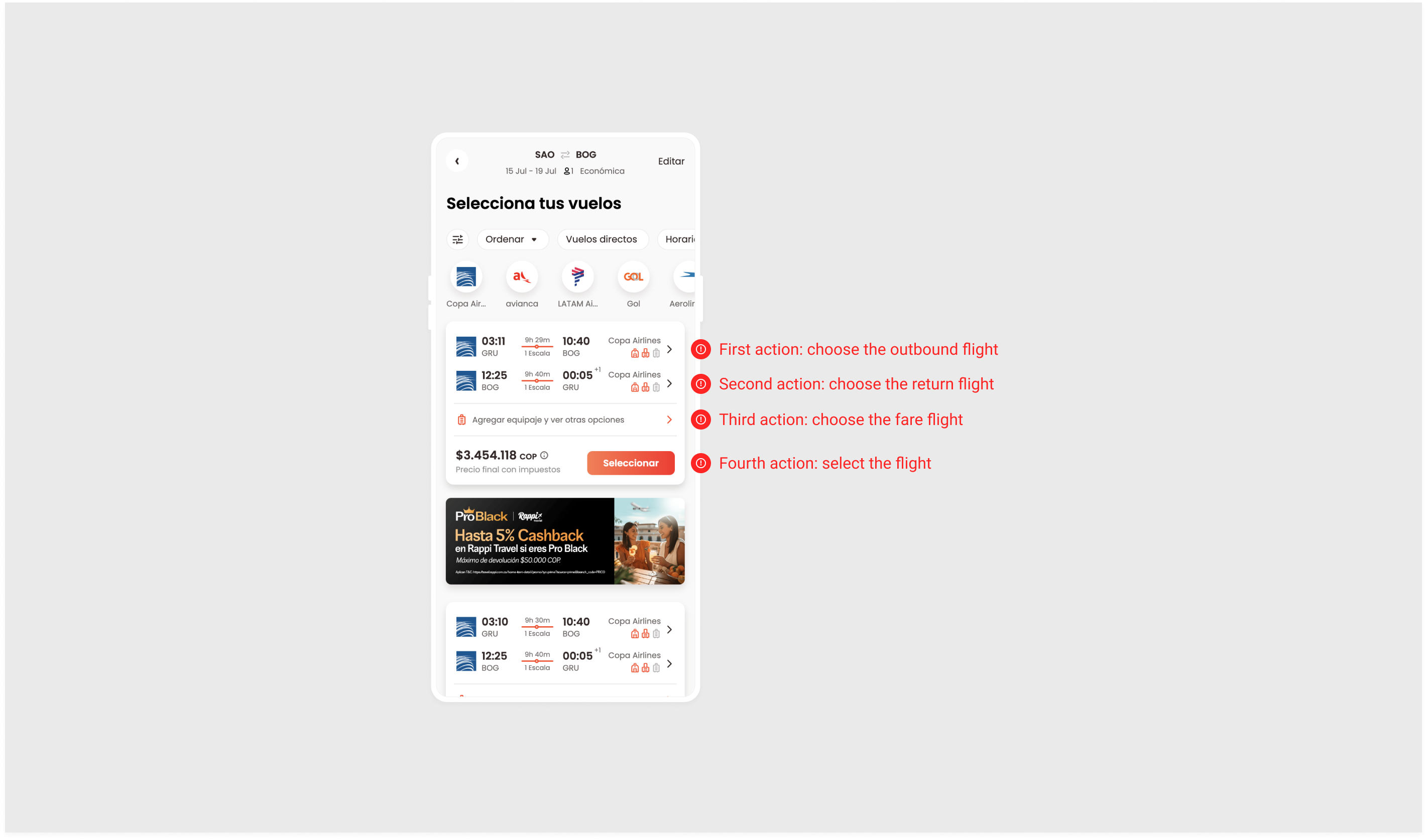
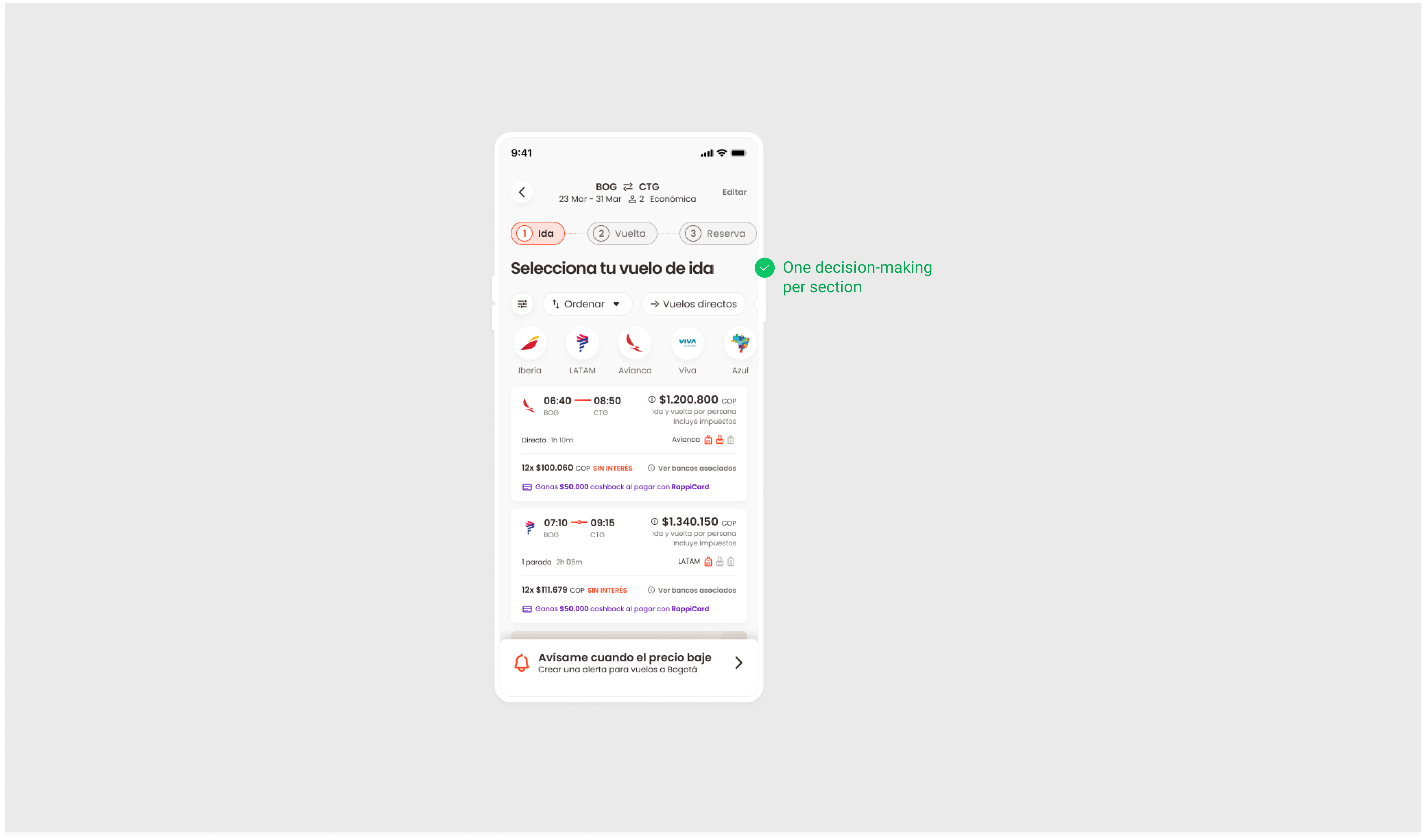
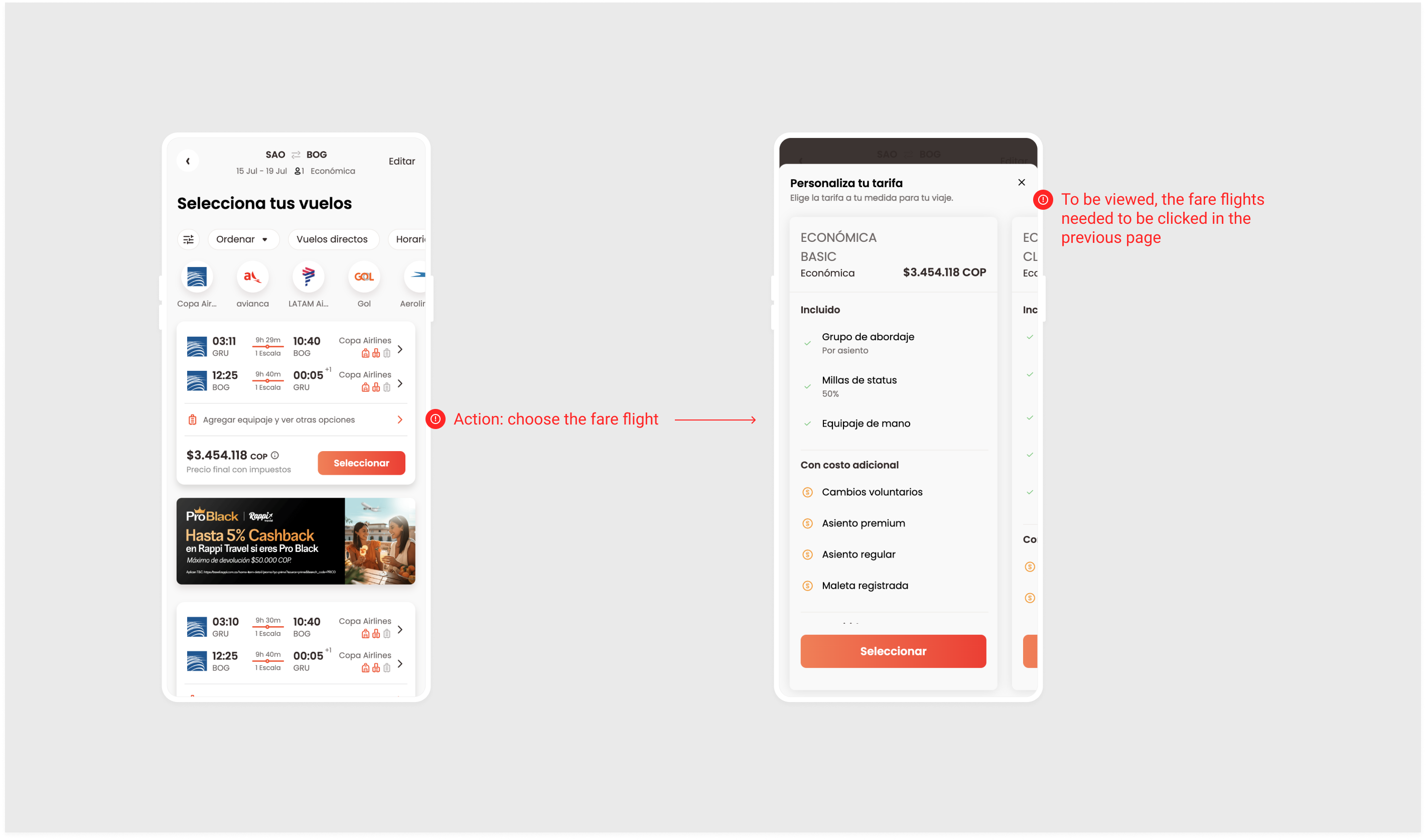
1st Problem:
Four actions were grouped on one card.
Assumption / Possible solution:
Limit to one decision-making action per section.
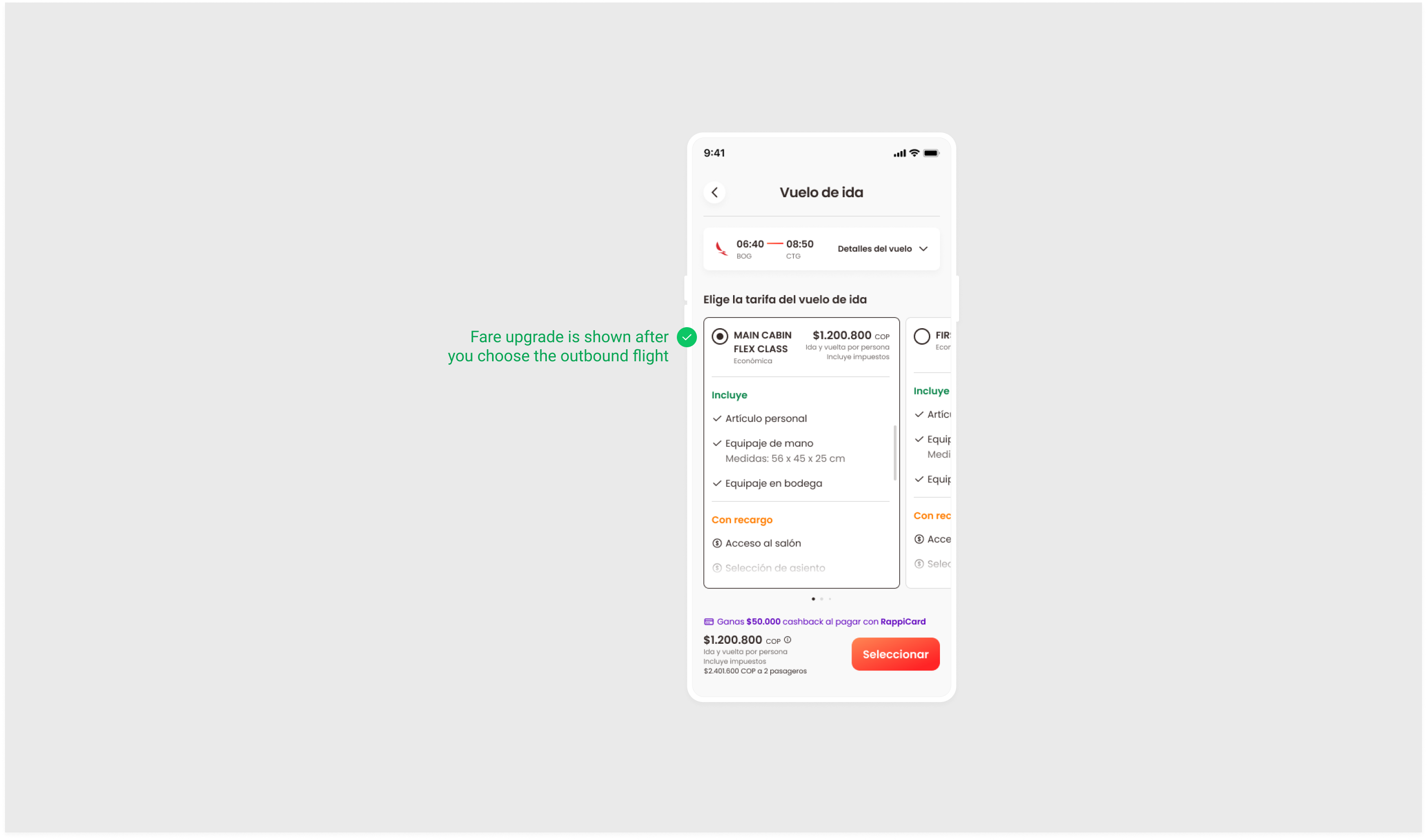
2nd Problem:
The fare change option was hidden in a second level, requiring users to discover it actively.
Assumption / Possible solution:
Display fare upgrade immediately after selecting the outbound or return flight.
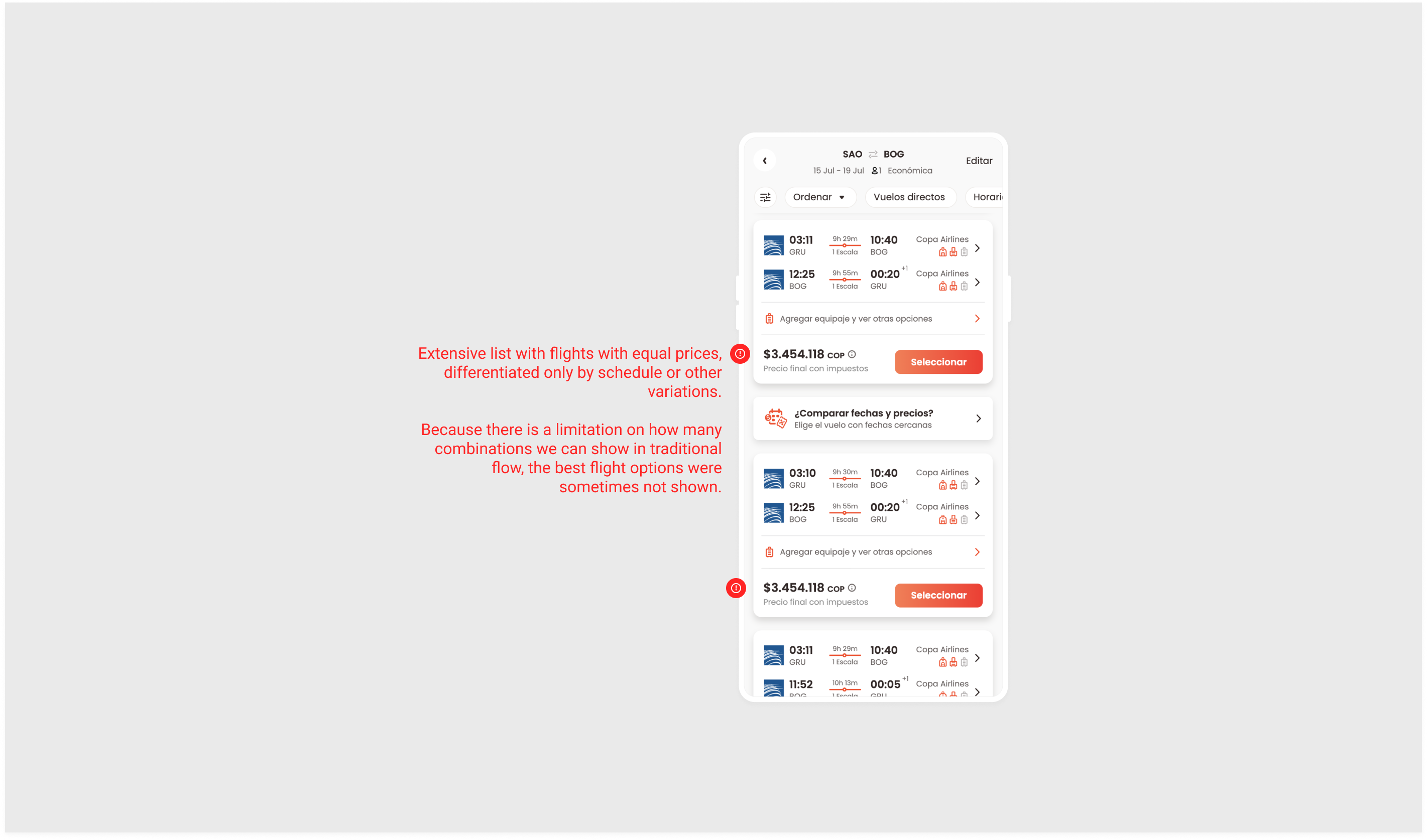
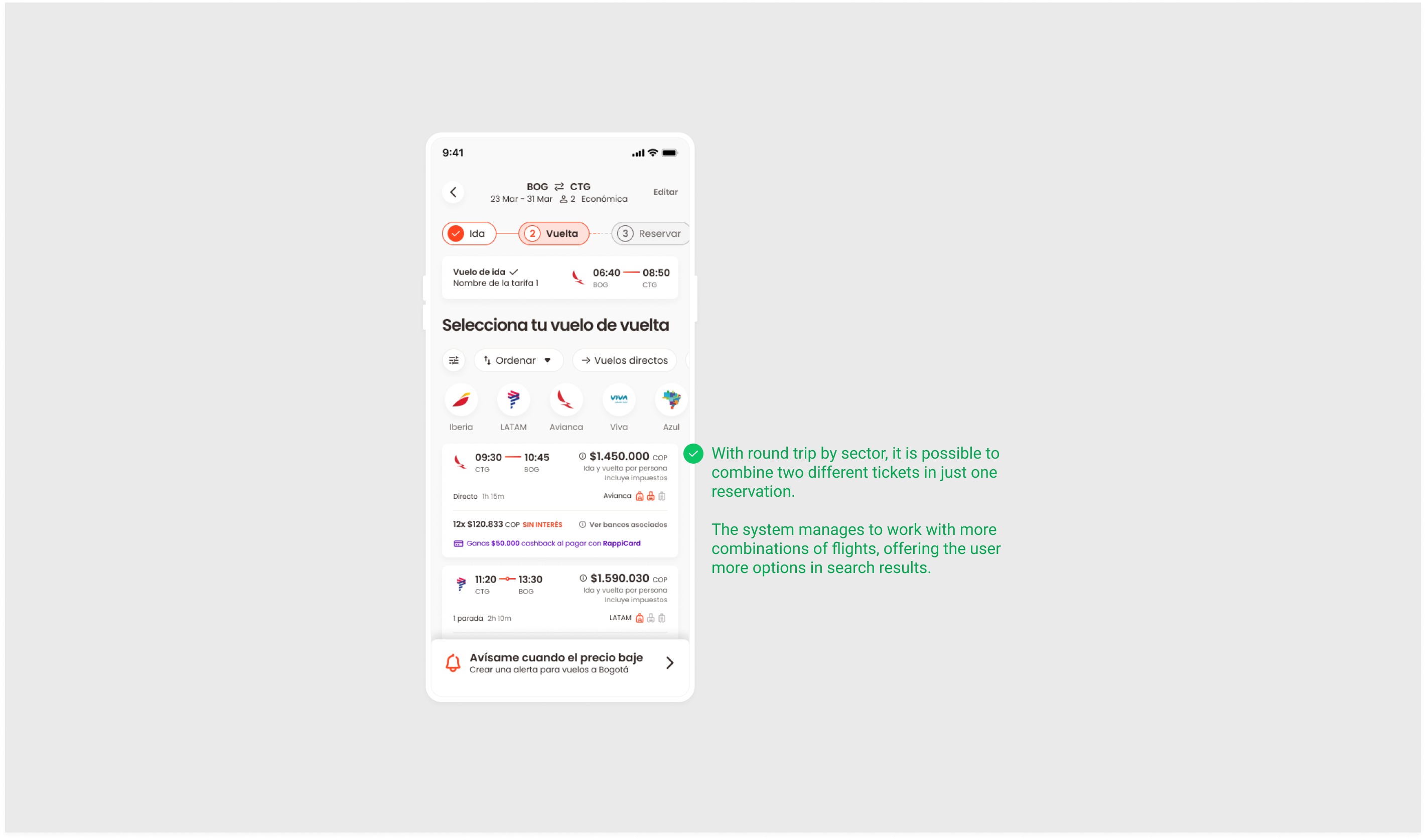
3rd Problem:
Long lists of flights with the same price, showing limited combinations and sometimes hiding the best options.
Assumption / Possible solution:
Use round-trip by sector to combine different tickets in one reservation, enabling more combinations and better options in search results.
Prototype
The prototype clarified navigation and interaction.
High fidelity in Figma:
Video recorded:
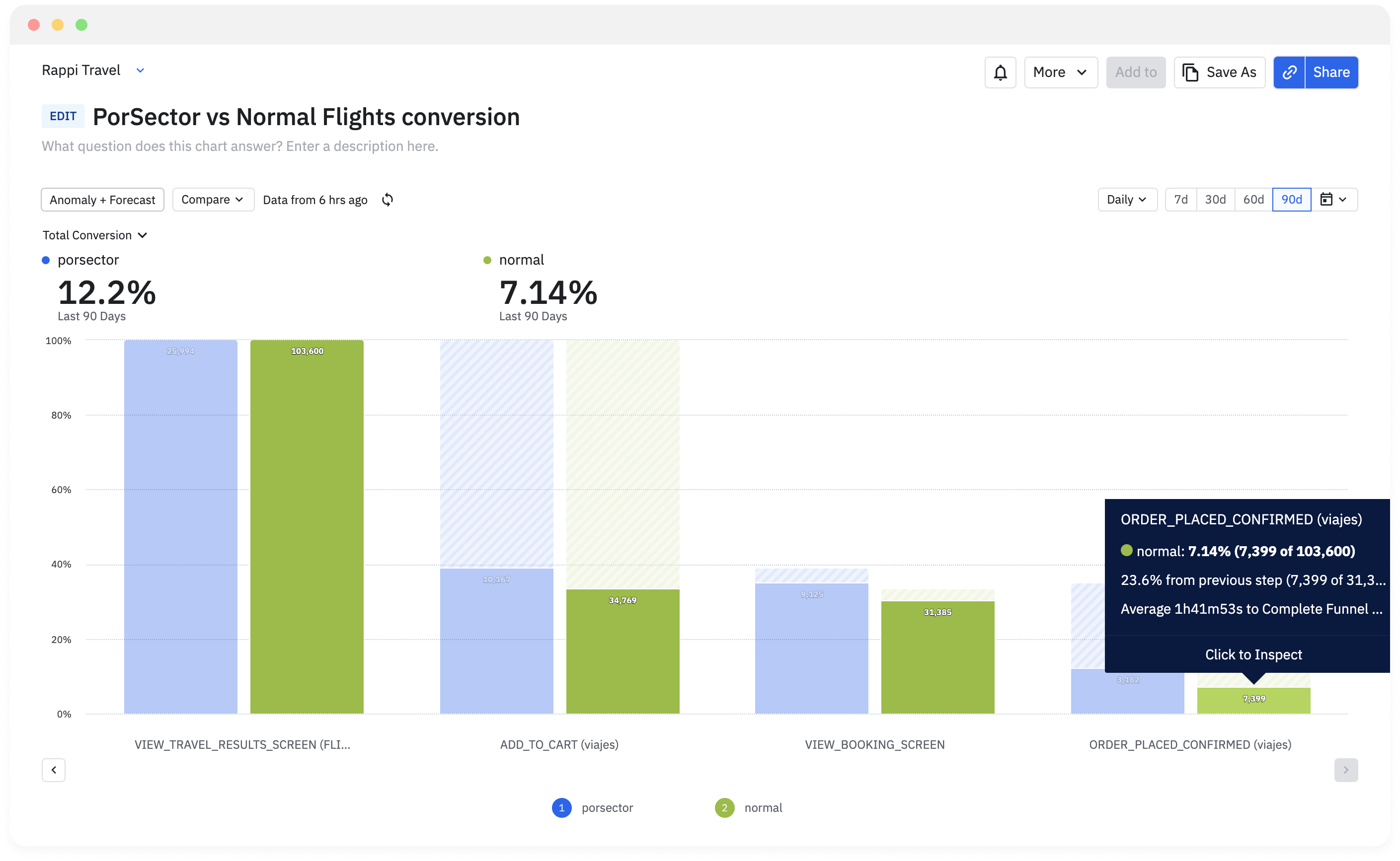
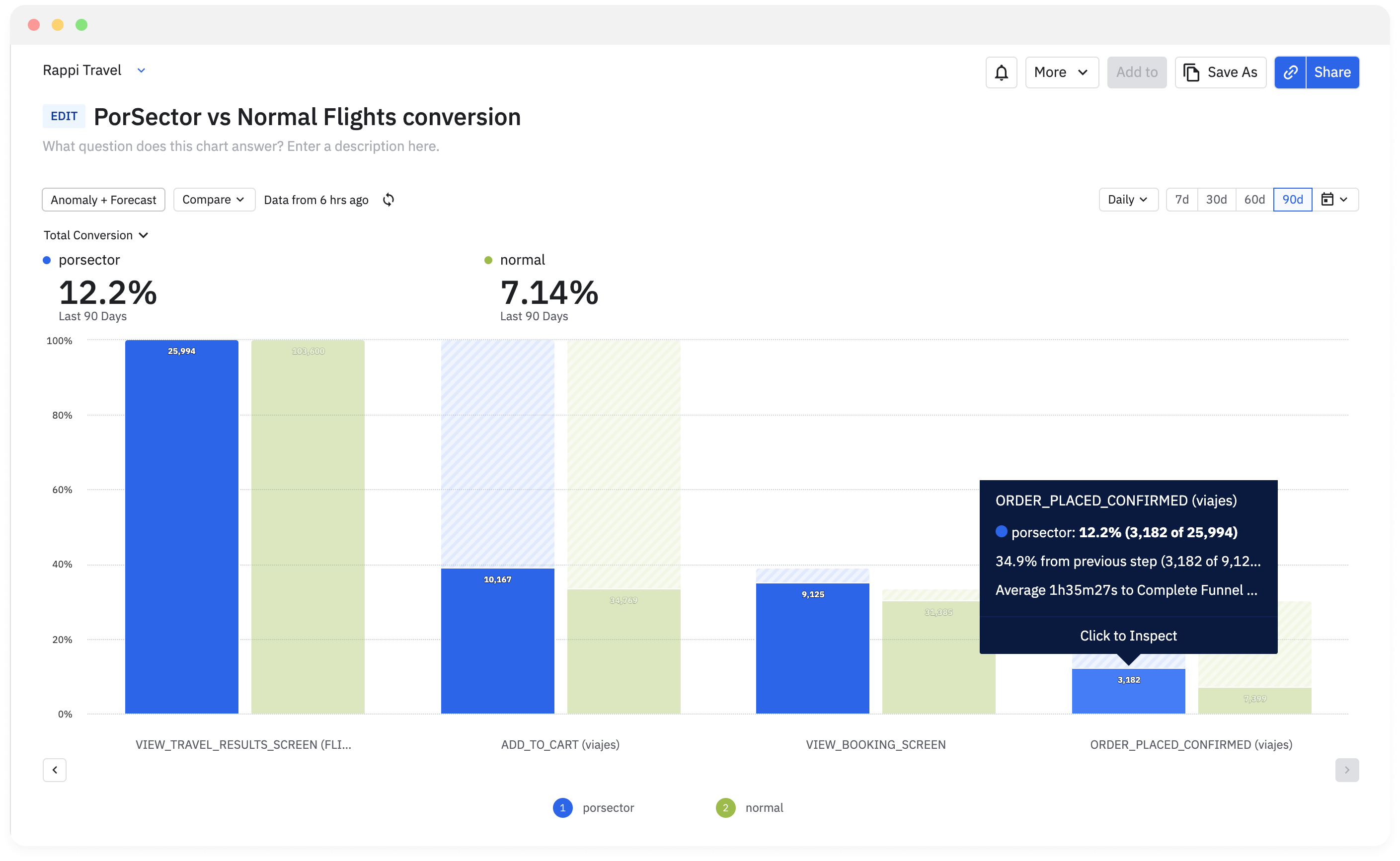
AB Tests
• Compared traditional flow vs. round-trip by sector flow
• Ran A/B tests on a small user base of domestic flights in Colombia to measure conversion
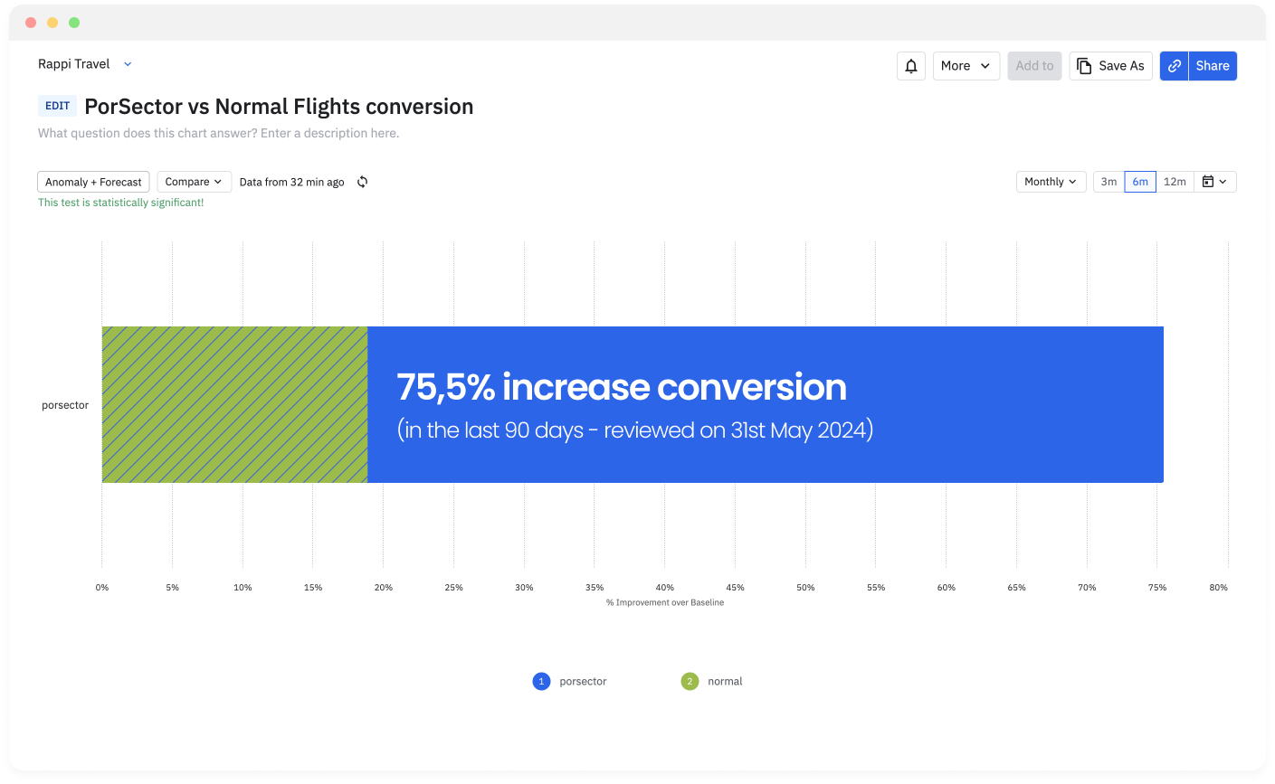
Tracked results with Amplitude charts.
Results
• Phase 1: 75.5% conversion increase in confirmed orders (last 90 days, as of May 31, 2024)
• Phase 2: 30% of Colombian domestic flight users adopted round-trip by sector flow
• Phase 3 (current): expanded to 50% of users
• Full rollout pending resolution of operational/technological issues
Takeaways / What I learned
• Simple design improves usability
• Multiple actions per session slow decision-making
• One action per session simplifies the task
• Even with more steps, focused actions reduced completion time and improved purchase flow